
Friday, October 14, 2016

Wednesday, October 12, 2016
A Nightmare Before Christmas: Research
Character
Development
- Title
of the movie
Nightmare
Before Christmas
- Production
company
Skellington
Productions
- How
was the stop motion completed? (ex. 3D printing, clay, wire, mixed
media, other)
Clay
- Who
were the main people working on the stop motion of the movie? Give a
short bio to at least 1 of those people. (other movies, education,
location, what they are known for..)
Henry
Selick
Tim Burton: Timothy
Walter "Tim" Burton was born August 25, 1958. He is an American film
director, producer, artist, writer and animator. He is known for his very
stylized works with their dark, gothic
and quirky fantasy characteristics.
Denise
Di Novi
Caroline
Thompson
Michael
McDowell
- What
is special about the movie? (largest puppet, first to use 3D
printing or style)
It’s
the first stop-motion animated feature to be entirely converted to 3D.
- Insert
(not a link) a video of a behind the scenes clip.
- What
draws you to this movie? What do you find interesting about the
movie? (Style, theme, subject)
The
style, story, and musical score and lyrics are all extremely attractive to me.
I enjoy creepier story lines and so this movie is a hit and run for me.
Sunday, October 9, 2016


Tuesday, September 20, 2016


Oil Fruit
Here we practiced using oils for the first time. I used a brush for the Apple and a palate knife for the pear. I accidentally made a bit of brown when adding colors into the Apple, but overall I like the stark difference between colors in both images.


Friday, September 16, 2016


Thursday, September 15, 2016
The Inedible project
- Who lives in the house you created? Is there a particular reason you picked the parts you did?
- In the Leaning tower of Pizza, mostly tourists are the ones who visit to get a slice of the best pizza in all of Italy. The Doughnut hole in the ground Houses are home to sugar trolls who's only source of nutrition is from the surrounding architecture which they are constantly having to rebuild, and the Apple Tree House is a playground in the trees specifically for kids who want to play pretend with their friends.
- What alterations did you have to make to make it look realistic?
- I had to warp several of the images to fit correctly to the food. I also had to erase part of the door on the bacon maple doughnuts so that the door looks like it's a part of the doughnut. I had to also warp the pizza to fit into the shape of the Pisa.
- If you could change anything about the piece, what would you do?
- Well, I would finish them for one. I would add shadows and work to make each piece look realistic.


Wednesday, September 7, 2016
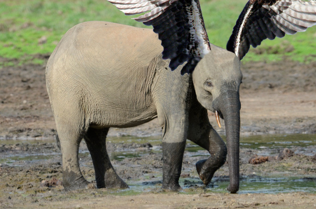
Oh, there's Dumbo!
1.What problems did you overcome during this project and how?
I had a difficult time getting the wings cut out nicely and then transferred over to Dumbo. Something happened in the process where they became really large and then once I shrank them down the edges were blurry. I then proceeded to work the edges so that there was not a white fizzy edge to the best of my abilities.2. If you could change anything about the piece what would you do?
I would change the wings and make sure that the edges were crisp and clean.3. Explain your animal? What is their name/species? How did you come up with this idea?
This is Dumbo. He has always been mistreated at the carnival for being different by the other elephants, but one fateful a trusting mouse took him under his, ahem, wing and helped him realize his ears are what make him special. Then, when some crows were teasing him and he couldn't stand it anymore Dumbo used his lucky feather to see if he could fly, and he soared.

Monday, September 5, 2016

Friday, September 2, 2016

Wednesday, August 31, 2016
If only I could be in four places at once...?

1. What problems did you overcome during this project and how?
I had a difficult time initially understanding how to move each individual 'me'm into the background picture. Once I better understood how masks worked, I had a relatively simple time of moving each image over.
2. If you could change anything about the piece what would you do?
I'm actually really pleased with this image. I'm sure I have only done a sub par job, but I can't think of what I would wish to alter at this point in time. I like the placement of each of my clones and the overall composition of the piece with the varying placement of the clones.
Thursday, June 2, 2016
Drawing Final Exam
1. My most successful project would definitely have to be my self portrait/expression project. Our assignment was to create a self-portrait that either showed expression, as a zombie, or mechanical. After some brainstorming I decided to go with the expression version of this project. When I was little my mom use to joke that I needed to clap when I changed subjects because I would go from one thing to another very quickly and without explanation leaving my listener dumbfounded, so I came up with the idea to have my thoughts spilling out from my head to show the way I think and how my thoughts are connected and disjointed at the same time. I used prismas, which I was still pretty unfamiliar with using, to make the piece colorful and lively. My greatest adversary in this project was my face. I had a terrible time making the shading look cohesive and not like I had wound up in a fight. Through my teacher's urging, I carried the purples and browns I had been using for the shading further into the face and I think it made it look much better. This piece is eye catching because the face is tilted slightly down with the eyes closed which makes me curious as to what that person is thinking, and then you see the colorful explosion that is the girl's thoughts answering your question. If I had more time or if I could change some things, I would work on making the face look even more like my own and I would add in a dreary or dark background to make the subject pop to viewers.

~
1. Other than my self portrait which I used to answer my previous question my most successful piece was my Dumdum drawing in prismas. We were given a lollipop and asked to draw it with as much detail as possible. I decided to draw my mystery Dumdum in purples and blues to allude to the flavor being blueberry. I first drew and outline of the basic folds and shapes in white on my black paper and I tried to fill up the space with the Dumdum head rather than making it small and including the entire stick. I then proceeded to layer different shades of purple to make the lolly look round and give the folds the darkness they need to have the proper texture. The weakest part of this piece is the green shadow. I attempted to it at a different location than I had originally drawn the piece in which gave it a different shadow from where the original highlights were. Also, I accidentally drew it incorrectly and made it too wide so now it bothers me every time I see it.

2. Several weeks ago I drew a mint in pastels. The white was layered very poorly in my attempt to create highlights in the plastic. It was not very successful at all because plastic I tried to draw in over the candy using highlights was unrecognizable for what it was intended to be. The piece had little shading and value to it so it was very uninteresting.
My opacity project, I feel like, was much more successful. I drew plastic canisters full of jelly bans. Each bean has a highlight, and behind each set of beans is a darker version of the beans to suggest that there are more behind the beans at the front. I also created perspective with this piece by have each subsequent canister behind the former and the beans in each canister getting smaller and smaller. It's altogether a more dynamic and interesting piece than the hard candy because I was able to better apply what I had learned.


~
1. Other than my self portrait which I used to answer my previous question my most successful piece was my Dumdum drawing in prismas. We were given a lollipop and asked to draw it with as much detail as possible. I decided to draw my mystery Dumdum in purples and blues to allude to the flavor being blueberry. I first drew and outline of the basic folds and shapes in white on my black paper and I tried to fill up the space with the Dumdum head rather than making it small and including the entire stick. I then proceeded to layer different shades of purple to make the lolly look round and give the folds the darkness they need to have the proper texture. The weakest part of this piece is the green shadow. I attempted to it at a different location than I had originally drawn the piece in which gave it a different shadow from where the original highlights were. Also, I accidentally drew it incorrectly and made it too wide so now it bothers me every time I see it.

My opacity project, I feel like, was much more successful. I drew plastic canisters full of jelly bans. Each bean has a highlight, and behind each set of beans is a darker version of the beans to suggest that there are more behind the beans at the front. I also created perspective with this piece by have each subsequent canister behind the former and the beans in each canister getting smaller and smaller. It's altogether a more dynamic and interesting piece than the hard candy because I was able to better apply what I had learned.

Wednesday, June 1, 2016
Self portrait features
This was my first attempt at combining all of the facial features into an actual face that should look like me. It did not turn out well. I did not understand how and where to shade the face to give it depth and make it more lifelike. I have since learned more about how to shade and how to draw noses and did a slightly better job on my final self portrait.

Wednesday, May 25, 2016
All things in-between- Scratchboard project
1) Recently I have desperately been wanting to go see the P!ATD concert and in wanting to see it have explore what the concert scene is typically like. Friends have said their is normally a lot of weed and booze around as well as vaping. A specific friend in my art class one day was showing some cool pictures of them vaping and i came up with the idea of using it for my movement piece because i had liked the example piece my art teacher, Ms. Rossi, had showed us with an exploding head and smoke coming out. The only thing this person required me to do in return was block out their eyes so that they could not be identified. This the idea came to me to incorporate the censored picture into the piece and use bars in the background as a suggestion of more people being present.
2) I used hatching in the smoke to give it color and direction in hopes of creating and airy, light texture as is usually given to smoke.
3) Initially I just had the face with the smoke coming out of nose as the center of the piece and nothing else. However, I soon decided that I wanted to have more "people" part of the piece to create a crowd so I added in the bars to create a background.
4) I implied movement in my piece by using hatching in the smoke to make it appear as if it is moving in particular directions and by having it come out if the nose it is assumed that is in motion.
5)I could improve this piece by having smoother lines and cleaner pieces of smoke. I added some smoke in after my initial design and I don't like the way it looks because it doesn't seem to glow with the other pieces well and looks distinclty different to my eye.
6) I used hatching to create brighter highlights in certain areas of the face and to give the smoke color and opacity. I also created bright white bars to accent the person and the crowd surrounding her.


Monday, May 23, 2016
Clap-Self portrait
The idea behind this piece is that when I was little, my mom would joke with me saying that I should clap when I change subjects because I would leave her confused as to how I got from one thing to another. So, I decided it was time to explain how my crazy mind works. I tried to connect different streams of thought and show jumps from one subject to another and somewhat how they relate to eachother. The values in the darks or shadows could have been pushed further to create a more realistic image. I used purples and a bit of brown to create the shadows in the piece. For the thought bubbles, I tried to use a background color that went along with the theme of that particular bubble and wrote as well as drew images that coincided with said theme. The bubbles not only portray happy, hopeful thoughts but mh negative thoughts as well which is more accurate to how I think. I wanted people to notice that negative thoughts-drawn in a dark gray and black in some places- creep their way into even the most happy of thought streams. Life isn't all rainbows and candycorn after all. I am happy in that I feel the piece does look like me to some extent and that the bubbles are interesting. This piece is original because it portrays my own thoughts and feelings connected to a picture of me. I have never seen something like this before, although I'm sure it has been done somewhere.


Tuesday, May 10, 2016
Opacity- Bertie Botts Every Flavor Beans
1. My project is very neat. I took time to draw each individual bean and add in highlights and shadows to give it a more realistic shape.
2. My background is more jellybeans but because of the angle of the picture, each subsequent jar of beans is smaller the farther back you go. Also, I filled in the spaces between the beans with a darker shade of the same color to represent the other beans that are behind the bean that are at the edge of the container.
3. I used pretty much the same colors for the beans as I saw in the picture; however, I used lighter shades of a color to create highlight and darker shades of that color to create the background and the idea of a greater amount of beans behind the ones that are most present in the piece.
4. I created contrast in my piece by making my highlights really bright and creating a dark background to make the beans stand out.
5. I used lighter shades of the same color, although in some cases if the color was already really light I used white, for the highlight on the outside of the beans and I used a darker shade of the same color for the background directly behind the beans to create the illusion that there are more beans than just the main ones you first see against the container. I created each bean in a round shape and tried to color it smoothly to create the seamless surface jellybeans often have.
6. I chose to have the background color corelate with the color of the beans at the forefront of the image to create the idea that there were more bean behind the ones that received the light.
7. To successfully create this piece, to give the proper texture and shape to the beans, I had to understand how to blend and push the prismas to get the colors I wanted.
8. I had difficulty with creating the proportions of the beans so they look correct as the piece goes further back. I didn't want it too look too drastic. If I could do this again, I think I would have pushed the highlights of the plastic more and made each color brighter and clearer.

Subscribe to:
Posts (Atom)